The way we design user interfaces can have a profound impact on the privacy of a user’s data. It should be easy for users to make choices that protect their data privacy. But all too often, big tech companies instead design their products to manipulate users into surrendering their data privacy. These methods are often called “Dark Patterns.”
When you purchase a new phone, tablet, or “smart” device, you expect to have to set it up with the needed credentials for it to be fully usable. For Android devices, you set up your Google account. For iOS devices, you set your Apple ID. For your Kindle, you set up your Amazon account.
Privacy by default should be the goal. However, particularly worrisome practices have been paired with the on-boarding process for many different platforms that serve as an obstacle to this aspiration.
What are “Dark Patterns”?
Harry Brignull, a UX researcher, coined the term “Dark Patterns.” He maintains a site dedicated to documenting the different types of Dark Patterns, where he explains: “Dark Patterns are tricks used in websites and apps that make you buy or sign up for things that you didn't mean to.”
The Norwegian Consumer Council (the Forbrukerrådet or NCC) builds on this critical UX concept in a recent report that criticizes “features of interface design crafted to trick users into doing things that they might not want to do, but which benefit the business in question.”
On the heels of this report, the NCC filed a complaint against Google on the behalf of a consumer. This complaint argues that Google violated the European Union’s General Data Protection Regulation (GDPR) by tricking the consumer into giving Google access to their location information. Likewise, the French data protection agency (the CNIL) recently ruled that some of Google’s consent and transparency practices violate the GDPR. The CNIL fined Google 50 million Euros (equivalent to about 57 million U.S. dollars).
The NCC report emphasizes two important steps in the on-boarding process of Android-based devices: the enabling of Web & App Activity and Location History. These two services encompass a wide variety of information exchanges between different Google applications and services. Examples include collection of real-time location data on Google Maps and audio-based searches and commands via Google Assistant.
It is possible to disable these services in the “Activity Controls” section of one’s account. But Google’s on-boarding process causes users to unintentionally opt-in to information disclosure, then makes it difficult to undo these so-called “choices” about privacy control, which were not ethically presented in the beginning. This creates more work for the consumer to retroactively opt-out.
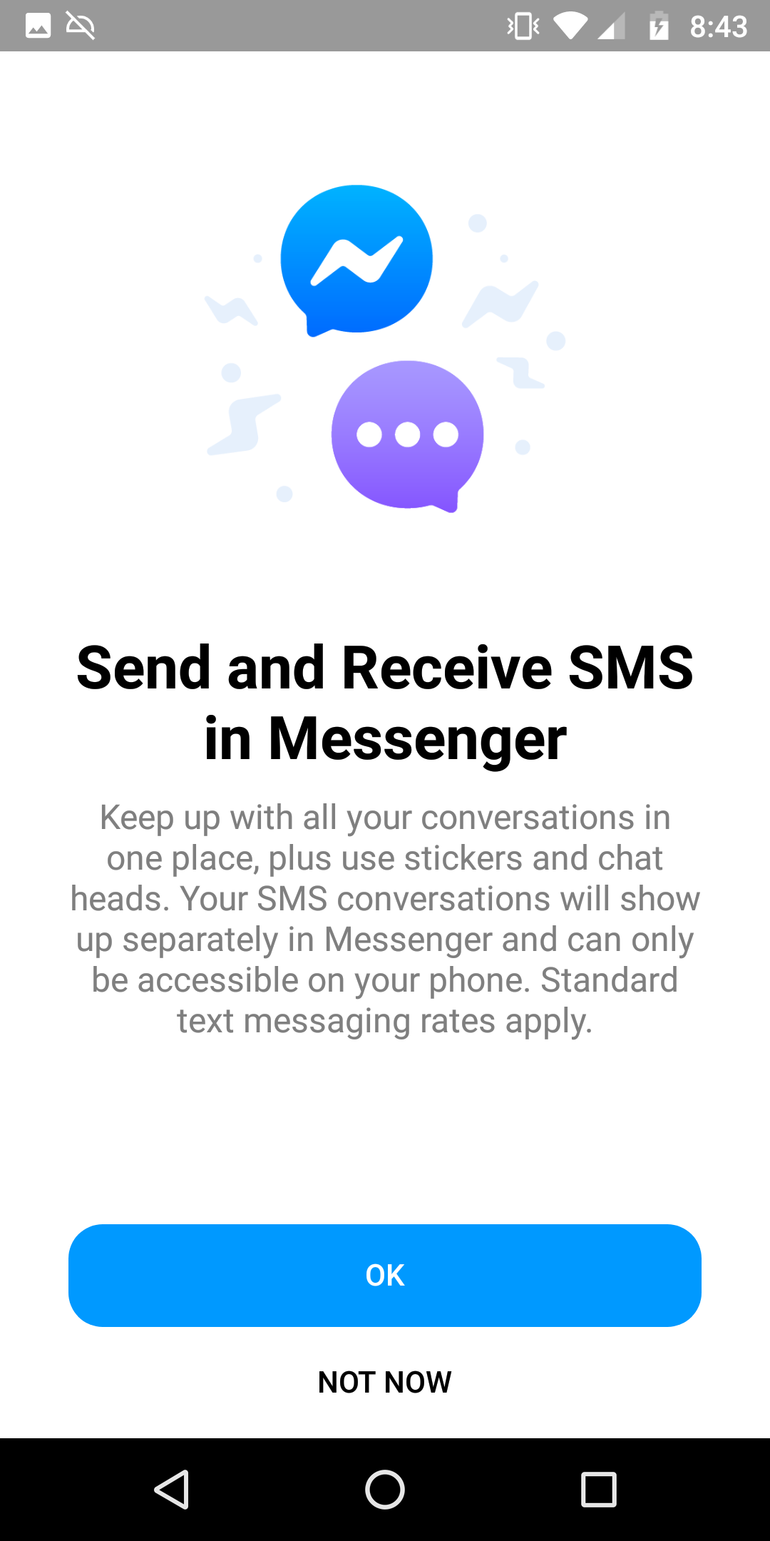
Of course, Google isn’t alone in using Dark Patterns to coerce users into “consenting” to different permissions. For example, in the image immediately below, Facebook Messenger’s SMS feature presents itself when you first download the application. Giving SMS permission would mean making Facebook Messenger the default texting application for your phone. Note the bright blue “OK”, as opposed to the less prominent “Not Now”.

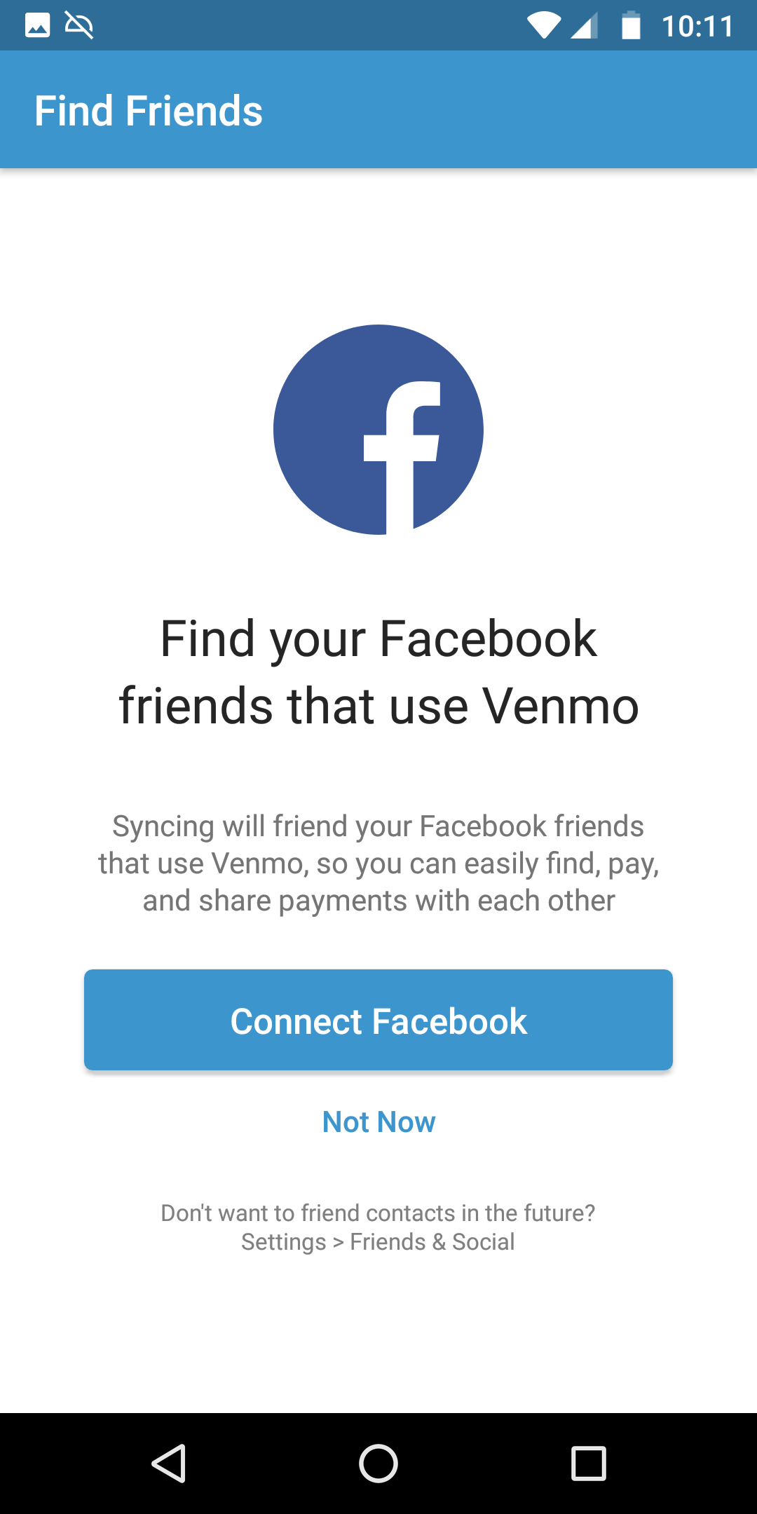
Likewise, in the next image immediately below, Venmo’s onboarding encourages users to connect to Facebook and sync the contacts from their phones. Note how “Connect Facebook” is presented as the bolder and more apparent option, potentially cross-sharing robust profiles of information from your Facebook network.

These are classic Dark Patterns, deploying UX design against consumer privacy and in favor of corporate profit.
What is “Opinionated Design”?
The common thread between Opinionated Design and Dark Patterns is the power of the designer behind the technology to nudge the user to take actions that the business would like the user to take.
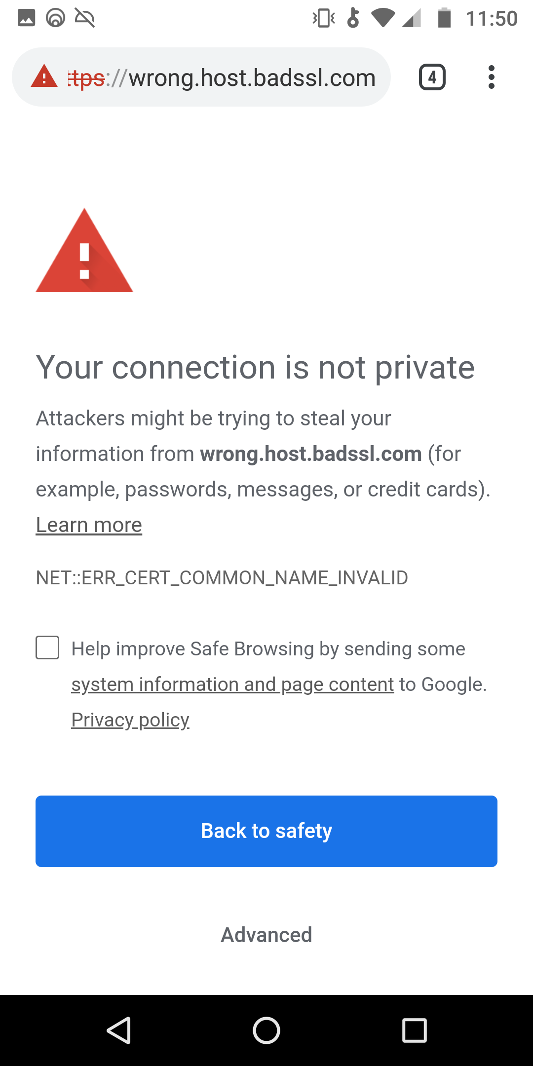
Of course, UX design can also guide users to protect their safety. “Opinionated Design” uses the same techniques as Dark Patterns, by means of persuasive visual indicators, bolder options, and compelling wording. For example, the Google Chrome security team used the design principles of “Attractiveness of Choice” and “Choice Visibility” to effectively warn some users about SSL hazards, as discussed in their report in 2015. When the safety of the user is valued by the designer and product team, they can guide the user away from particularly vulnerable situations while browsing.
The common thread between Opinionated Design and Dark Patterns is the power of the designer behind the technology to nudge the user to take actions that the business would like the user to take. As in the case of Google Chrome’s SSL warnings, where explanations and clear guidance to safety can help to prevent abuse of a person navigating the web.
These are examples of Opinionated Design:


SSL warnings are presented to the user and given brief explanations on why the connection is not safe. Note how “Back to safety” is boldly presented to guide the user back from an potential attack.
Privacy by Default
Part of the solution is new legislation that requires companies to obtain opt-in consent that is easy for users to understand before they harvest and monetize users’ data. To do this, UX design must pivot from using Dark Patterns to satisfy business metrics. Among other things, it should:
- Decouple the on-boarding process for devices and applications from the consent process.
- Visually display equally weighted options on pages that involve consent to data collection, use, and sharing.
- Consumers feel uneasy about privacy, so default to the “no” option during setup.
- Coercing “consent” for lucrative data bundling may satisfy a temporary metric, but public distrust of your platform will outweigh any gains from unethical design.
We must continue this critical discussion around consent and privacy, and urge product designers and managers to build transparency into their applications and devices. Privacy doesn’t have to be painful and costly, if it is integrated in the beginning of UX design, rather than stapled on at the end.


